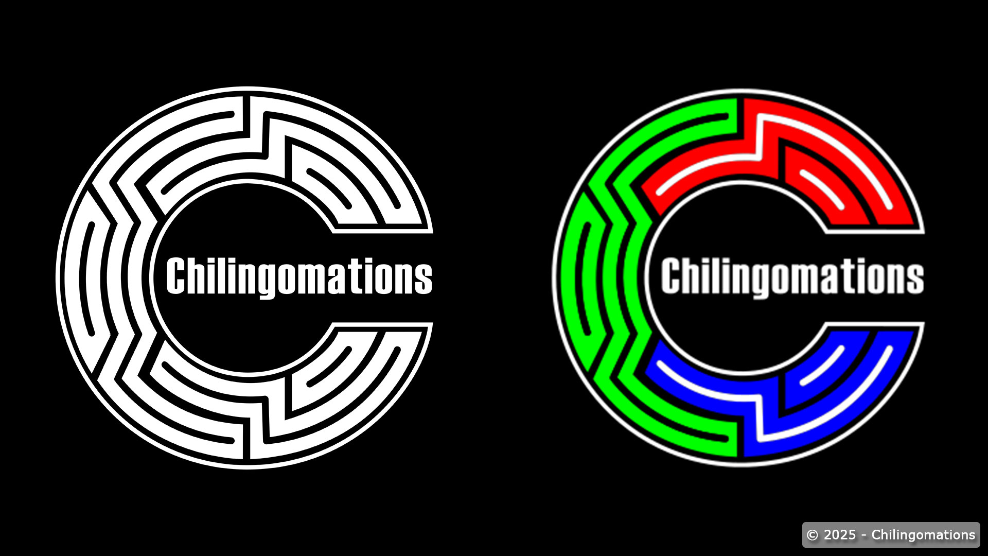
The old logo was good served it purpose. However, the color scheme feels too much like Halloween and the overall design feels too crowded. However, a simpler and cleaner version of the logo felt necessary for launch of the website. After doing some research and combining serval ideas, I finally came up with a new design that feels more in line with animation. Be on the lookout for an animated version of the logo in the future.